Why
When I joined Seekda, there was already a UI-kit and Angular components based on it. However, there was no documentation detailing usage guidelines, and each task was addressed individually through Jira discussions.
Subsequently, the parent company aimed to unify its various products and services under a cohesive style. As the UX director aptly stated:
"The products should look similar, not necessarily like twins, but like siblings."
We selected the Ant.Design system as our foundational framework and set out to evolve Seekda's existing materials into a comprehensive design system.
As I was responsible for Seekda's design, I had the following tasks:
- Adapting our products' current style to align with the overall style of the parent company
- Updating the library of components and patterns
- Creating documentation on the use of components, patterns, typography etc.
- Actively engaging with the programming team and providing explanatory guidance
- Establishing a process for the ongoing support and scaling of the design system
Starting Conditions
At the beginning of this initiative, we had:
- Established Angular-based UI components
- Various legacy product components in need of modernization
- A foreign design system that offered more features than we needed
- Proficiency in atomic design principles within the developer environment
This project presented a fortunate opportunity, situated within a distinct business unit, providing an existing foundation and flexibility in design decisions.
Basics
The basic patterns and general "anatomical design" had already been implemented,
and I only had
to develop the existing functionality.
to develop the existing functionality.
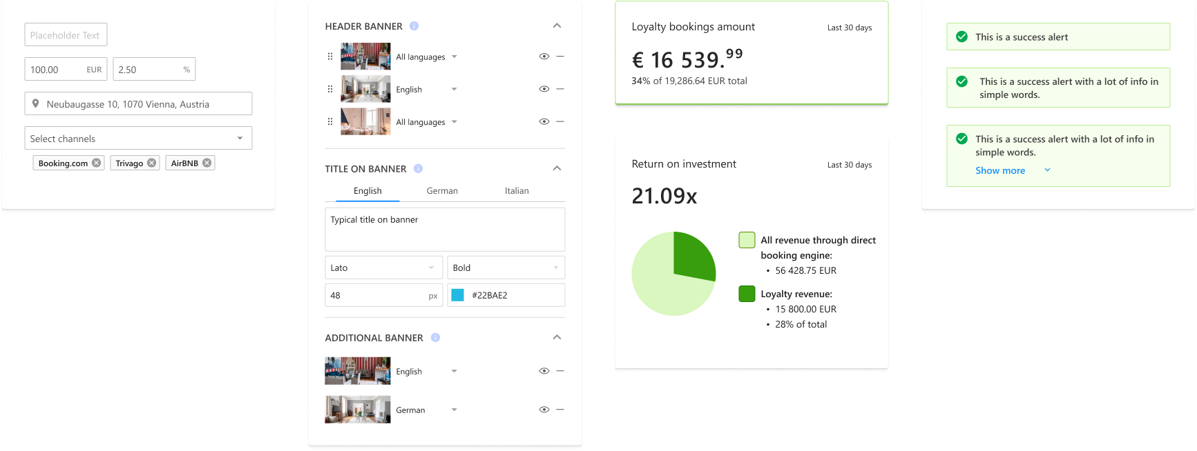
And these elements should easily fit into more complex patterns
Which would fit perfectly into general templates
Complications
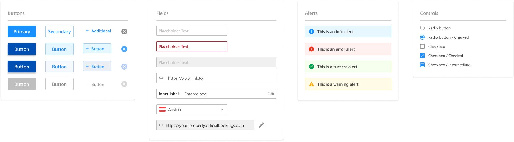
Directly transferring the entire Ant.design UI kit was unnecessary, as it contained many redundant elements not needed at this time. By selectively integrating only the essential components, we ensured a more streamlined and efficient system tailored to our specific needs.
For instance, while the kit offered dozens of button options, only a few were required for our design.
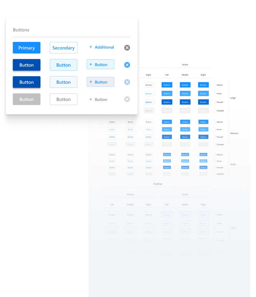
Some components were challenging to develop and maintain, at times, it was easier to code them from scratch than to expand their functionality.
Consequently, I had to proceed with great caution and collaborate closely with the development team.
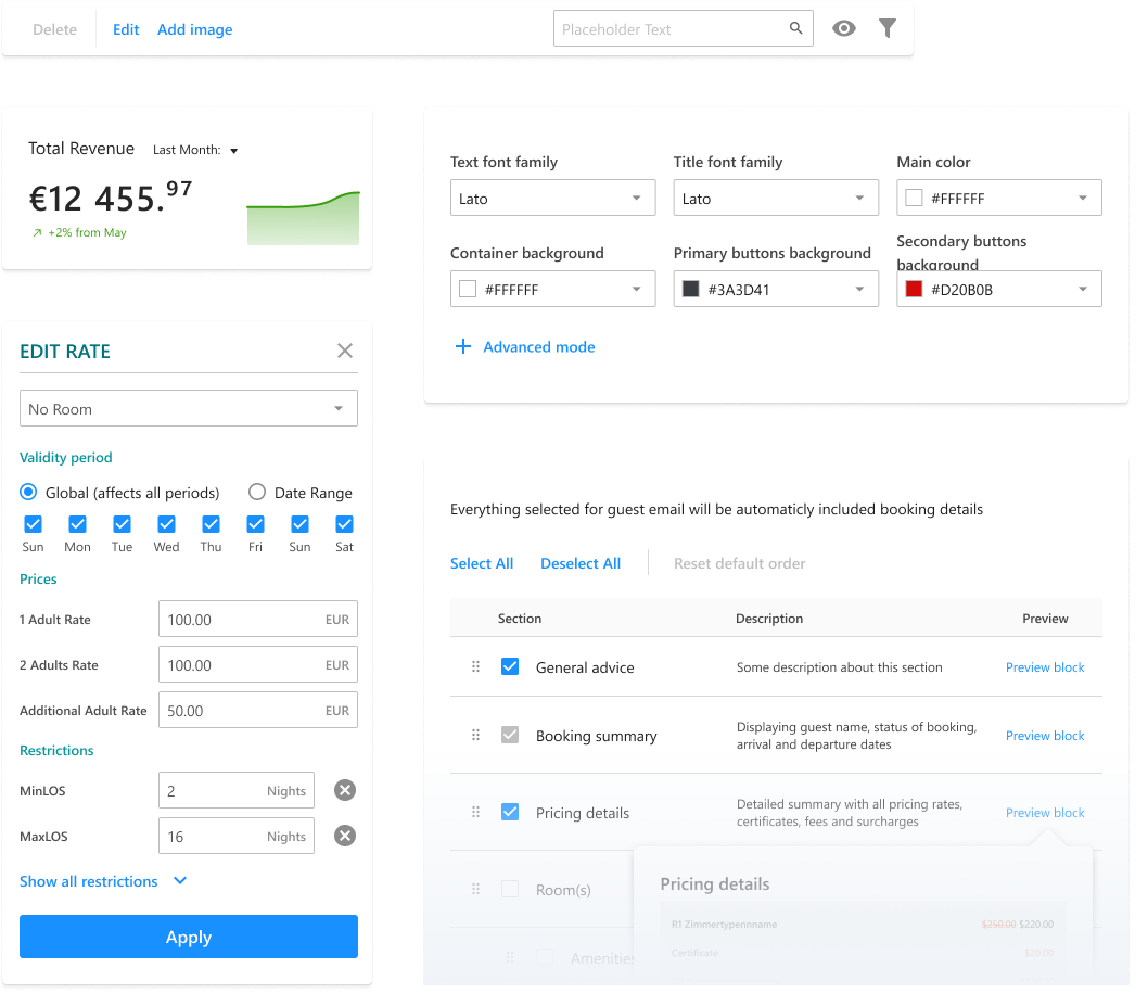
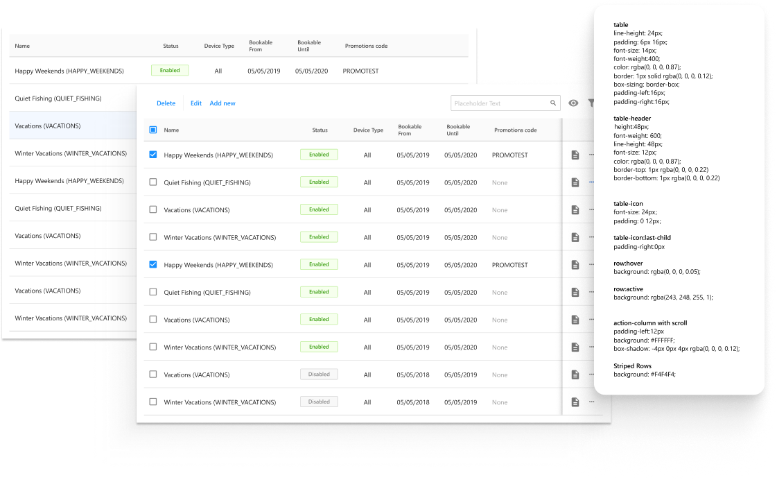
At that time, Figma didn't have Devmode, so the mockups for creating and updating components looked like this.
Scalability
Our system had to be stable, capable of solving most design problems, and easy to maintain.
This includes flexibility in Figma.
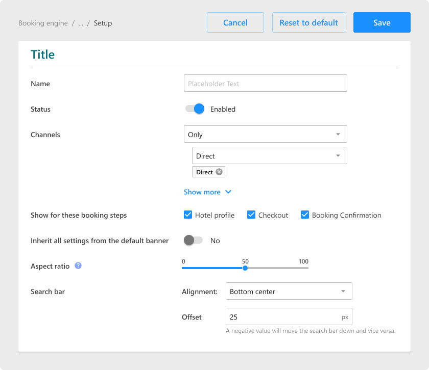
To enhance efficiency, I customized a majority of parameters within the library, optimizing them to suit my workflow preferences.
Adhering to atomic design principles, utilizing nested components, and leveraging component properties to simplify variants helped me maintain scalability of the elements. It remains a continuous learning process to discern which components should be reusable and which elements are specific to edge cases.
This includes flexibility in Figma.
To enhance efficiency, I customized a majority of parameters within the library, optimizing them to suit my workflow preferences.
Adhering to atomic design principles, utilizing nested components, and leveraging component properties to simplify variants helped me maintain scalability of the elements. It remains a continuous learning process to discern which components should be reusable and which elements are specific to edge cases.