2020 — 2023

Power Grid

The glorified spreadsheet for operating with prices and availability in hotel from one screen

Problem

Users could not view room availability and prices in one place, which led to a cumbersome workflow. To perform these actions, users had to open each room or price in a separate window in calendar mode.

Goals

  • Enable users to effectively manage hotel operations from a single screen.
Reduce the number of steps/time to make changes.
  • Provide a complete overview of hotel status on one page
for improved decision-making.
  • Reduce the workload on the support team.
  • Meet industry standards.

Preparing for a long journey

The project started with the support of the company's UX director, and then I took the lead on the design. I collaborated closely with programmers, the support team, and individual clients.
In the early stages, I conducted thorough research on similar or competing instruments and analyzed feedback from our users on our current tools.
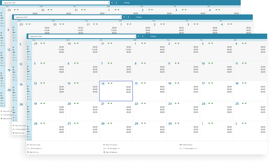
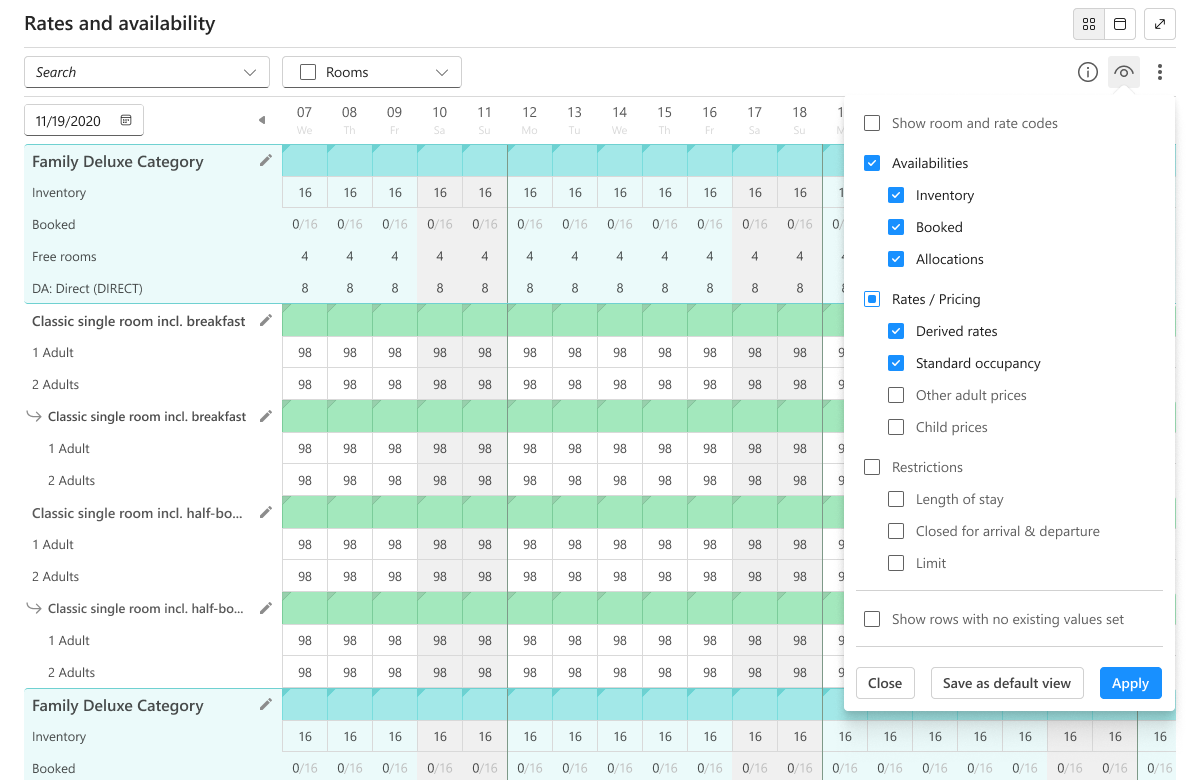
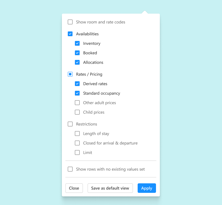
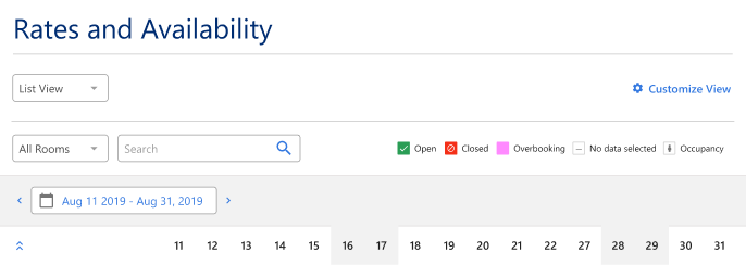
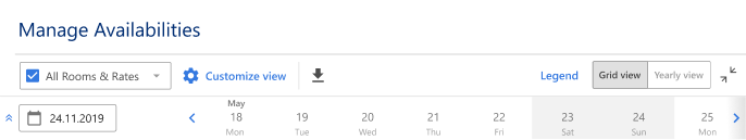
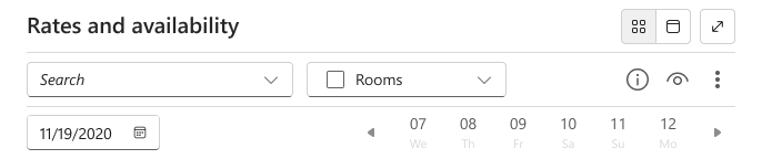
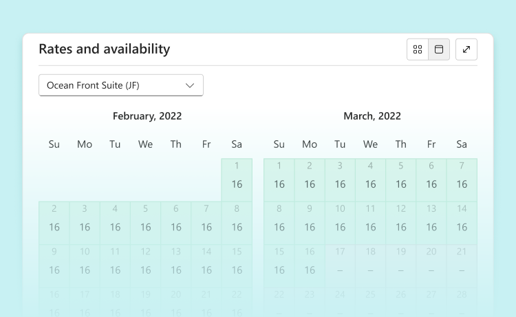
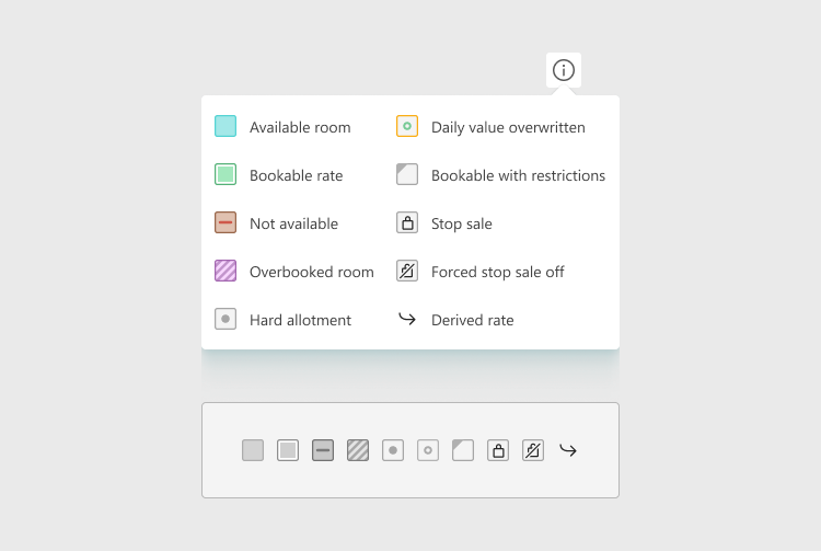
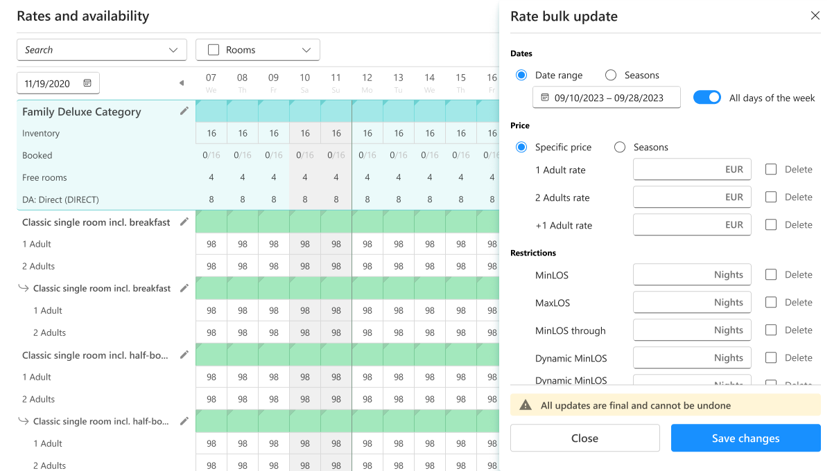
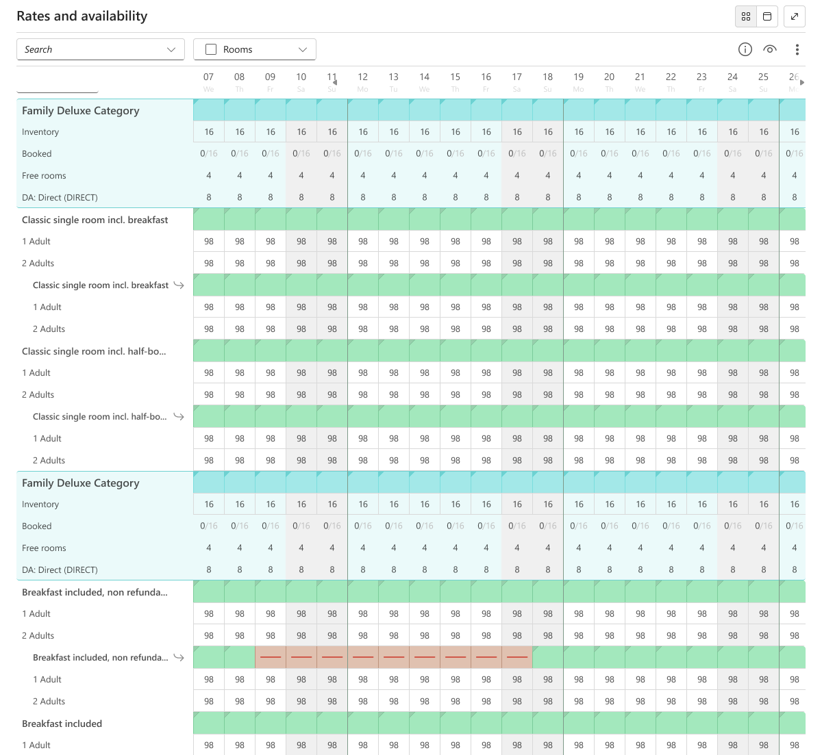
From the start, we addressed major technical limitations, particularly the challenge of presenting a large amount of data on a single screen.
For example, an average hotel client with 4-5 rooms, each with about 5 rate categories across various occupancies, results in a substantial number of cells when displaying two weeks' data.

First steps

Having created the first mockups that met the goals, we collected feedback exclusively from the company's internal teams.
After adjusting and implementing the first version, we conducted user interviews with individual customers, identifying problems with the initial hypothesis:
  • Laptop screens' limited space caused dissatisfaction among users, who preferred the calendar display with a longer time frame.
  • Users also struggled to differentiate between room and price lines.
  • Information overload proved burdensome.
One of the first versions that was tested

Evolution of toolbar

The toolbar has gone through several iterations. The main challenge was that the functions were constantly being added, we needed to save as much space as possible and simplify everything for users to understand.

Information overload

We have implemented a customization feature that allows users
to personalize the information displayed according to their preferences.
For example, some users may be interested in receiving information
on room allocation for specific channels such as Booking.com or Expedia, while others may prioritize information on "standard price" or "minimum stay" restrictions.
Users were also given the option to save their preferred view so that they don't have to customize it all the time.

Search & room filter

Real-time search and room filters have further simplified the user experience, although filtering by rate type (regular, derivative, B2B, etc.) was deemed unnecessary based on feedback.

Switch to calendar

The "view calendar" switch allows users to easily view the availability of rooms several months in advance.
Small property owners (who complained the most) should have been satisfied, but in fact they mostly did not use it.

"Expand to full screen"

This button expands the entire table, removing all the elements that user don't need at the moment (header, navigation, etc.) from the screen.

Color Blindnes

Recognizing that users may not rely solely on color to comprehend the state
of a room and/or rate, we revamped the iconography and introduced
a helpful legend.
This thoughtful adjustment ensures that all users, regardless of color perception, can easily understand the information presented.

Room & rate codes / ID

The column containing room/rate names underwent multiple redesigns to enhance usability. Users frequently searched using IDs(room and rate codes), resulting
in a separate ID column.
For users not requiring this additional information (power users and small properties owners) , we implemented
the option to disable the display of the ID column, streamlining their experience.
It is worth noting that the column was designed for a size of 35 characters, since 90+% of all rates names in hotels do not exceed this number

Bulk update

Also, one of the main advantages was the ability to make bulk updates for rooms and rates —o save and immediately, without closing the window, proceed to the bulk update of another room/rate.

Final design

Goals achieved

Number of steps

decreases with each update. Instead of opening a new page for each price, a user can simply click on the next row in the table.

Enhanced Efficiency

The duration needed to update a room has been greatly reduced. Additionally, with each update, the efficiency coefficient experiences exponential growth.

Global Overview

We have introduced a feature that allows users to compare room prices and availability seamlessly on a single screen.
This enhancement provides a holistic view, enabling more informed decision-making by presenting all relevant information in one convenient location.

Relevant Information Only

Users can now filter and display only the information they need at any given moment.

Improved Accessibility

Consideration for individuals with visual impairments has been incorporated.